Paging,
Made Simple
A refined paging experience for SwiftUI, combining flexible options, polished interactions, and platform-wide harmony for truly consistent navigation.
PagerKit v1.0.1 - New Modifiers, Performance Improvements, and a Refreshed Website
This release introduces the new Page Indicator Footer, improved alternative text handling, sharper DocC visuals, and a redesigned website built for clarity and performance.
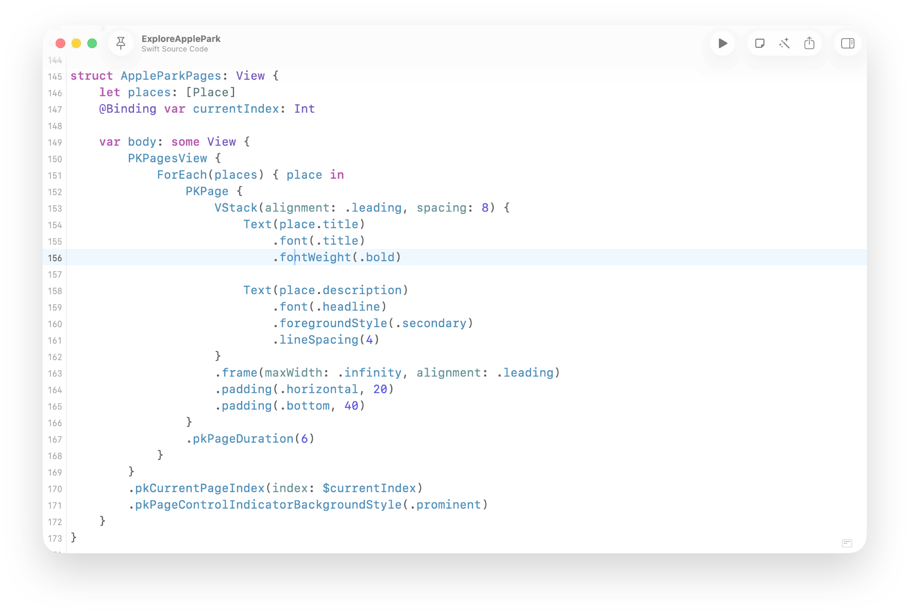

Set the Pace of Every Page
Control how long each page stays visible with a single modifier. Perfect for walkthroughs, onboarding flows, or any experience where timing shapes the story.
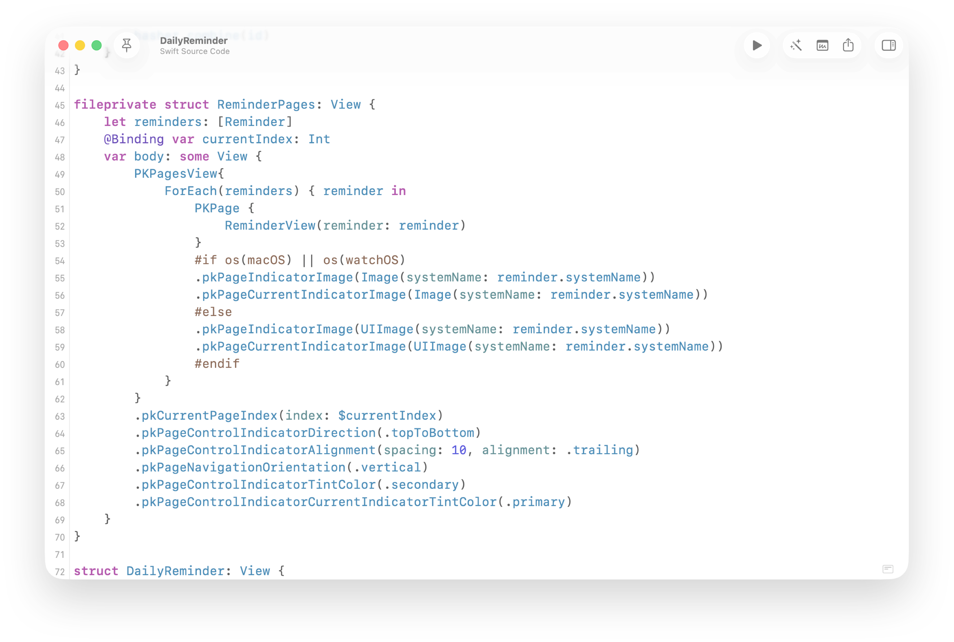

Refined Control Over Every Indicator
Shape the page indicator to match your app’s style and flow. Customize direction, alignment, imagery and color to create an experience that feels native to every platform.
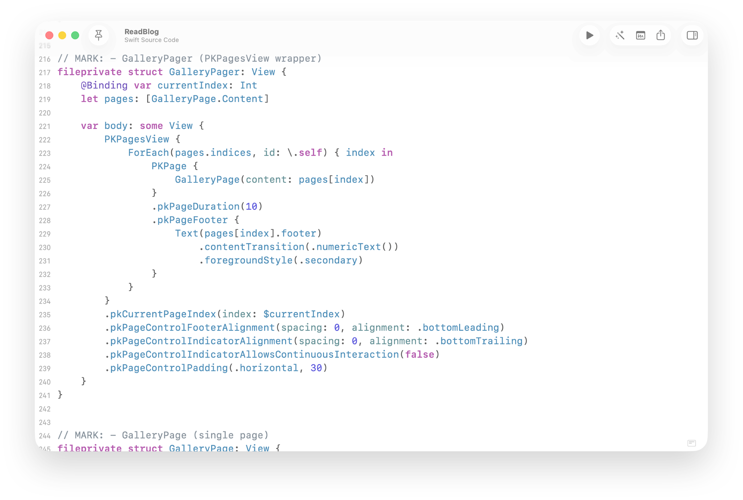
Perfect Fit, Even in Tight Spaces
PagerKit adapts effortlessly to smaller surfaces with configurable spacing and footers, ensuring your content stays readable and your navigation stays precise.
Compare
SwiftUI Paging Has Limits
By default you get paging, not control. PagerKit restores it with refined events and indicators across every Apple platform.
Built-in DocC
Every API ships with inline Xcode documentation.
Page Durations
Per-page timing, built in. No UIKit required.
Support for macOS & watchOS
Full SwiftUI implementation with UIKit-level behavior.
Customizable Indicator
Style and align indicators with simple SwiftUI modifiers.
Native Integration
Uses ForEach and result builders exactly like SwiftUI.
Community Ideas Into Features
Your ideas evolve into shared features that improve the framework for everyone.
Integration
A Perfect Match for Your UI
PagerKit brings UIKit-level control into a pure SwiftUI API. All working together seamlessly across every platform.
Get Started
Get Started in Minutes
Follow the guided documentation to add package into your project. You’ll be integrating advanced paging interactions in minutes, not hours.